A vintage game which my children still enjoy! I especially love the typography on the board. This game is from 1975. I posted another - older - version of this game here.
Posts tonen met het label graphic design. Alle posts tonen
8 november 2012
31 oktober 2012
Valentines - Marian Bantjes
Marian Bantjes is one of my favorite designers. On her website I came across these Valentine cards (2012) which she made:
'Because I travel a lot, I decided to use old postcards for my Valentines this year. I sent about 480, and the cards range over about 90 years: from 1901 to the late '80s, I think. They are from all over the world and they went all over the world. About 100 of them had writing on the back and had been posted before.
Then, they're all overprinted in silver with my image, which says "From me wherever I am / To you wherever you are."'
The Valentine Cards below are from 2010:
'I solicited my friends to send me all their used Christmas cards, and I started getting exciting envelopes of cards in the mail. I created the design of the heart for laser cutting. I wanted most of the card image to be cut away, but there to be enough left that some semblance of image remained; that you could tell it came from a christmas card. The final result exceeded my most hopeful expectations. How these cards (most of which were, in their original state, nothing special, or even downright ugly) gained so much more from the process.'
18 februari 2012
U30
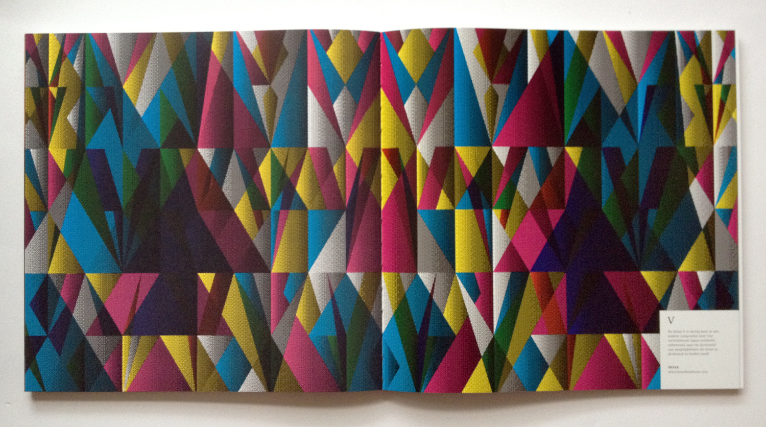
Around Christmas I received this beautiful book. It was a giveaway from Libertas, a printer we work with. The company celebrated their 30th anniversary. For that occasion they initiated to publish and produce this book. U30, a book about the creative industry in the 5th largest city in the Netherlands, Utrecht. The concept is developed by Enof. The design is by 30 different creatives from Utrecht.
28 september 2011
Scripta manent
This is a book I rescued from the garbage at work. It is a collection of (fake) letterheads printed on 'Bankpost' This book is actually a sample book for stationary paper. The letterheads were designed by 5 famous Dutch Designers from the sixties and seventies such as Wim Crouwel.
In my work as graphic designer I've designed quite a lot of letterheads however they look a lot different from the ones I show here. Office stationary has changed a lot with the use of Word templates. These days most of the effort goes into designing the inprint. And the only design choices I seem make in this proces are 'do I use Verdana or does Arial look more appropiate?'
Abonneren op:
Posts (Atom)